An end-to-end ML pipeline using Bidirectional LSTM networks to forecast
multi-pollutant air quality from a 5-year NASA dataset for Baghdad, and to compute
US-EPA Air Quality Index metrics — with seasonal feature engineering, uncertainty
quantification, and a standalone interactive dashboard.
An applied deep-learning research project: a Bidirectional LSTM (BiLSTM) network trained
on a 5-year NASA air-quality dataset for Baghdad (2020–2025), forecasting five pollutants —
CO, SO₂, SO₄, PM2.5, and NO₂ — and mapping predictions to US-EPA Air Quality Index health
categories. Results are served through a standalone, single-file interactive dashboard
rather than a static notebook.
Problem
Air-quality pollutant levels are noisy, seasonal, and interdependent, which makes
reliable short- and medium-term forecasting genuinely difficult — small time series make
standard train/test splits unreliable, outlier spikes distort ordinary loss functions, and
different pollutants respond very differently to the same modeling approach.
Solution
A BiLSTM sequence model per pollutant, trained with Huber loss for robustness to
concentration outliers, circular harmonic (sine/cosine) month encoding to capture
seasonality, and walk-forward cross-validation appropriate for a small time series. 95%
confidence bounds come from Monte Carlo Dropout. Every result is backed by a full
statistical battery — MSE, RMSE, MAE, MAPE, R², Durbin-Watson, Pearson and Spearman
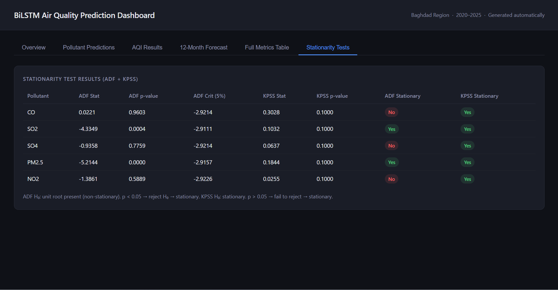
correlation — plus ADF/KPSS stationarity testing on the underlying series before modeling.
Key Features
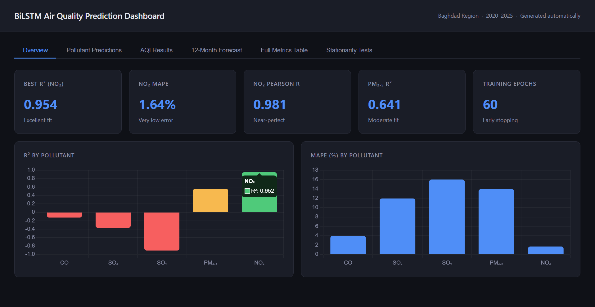
Overview: at-a-glance best-performing pollutant, MAPE, Pearson r, and
training configuration (60 epochs, early stopping).
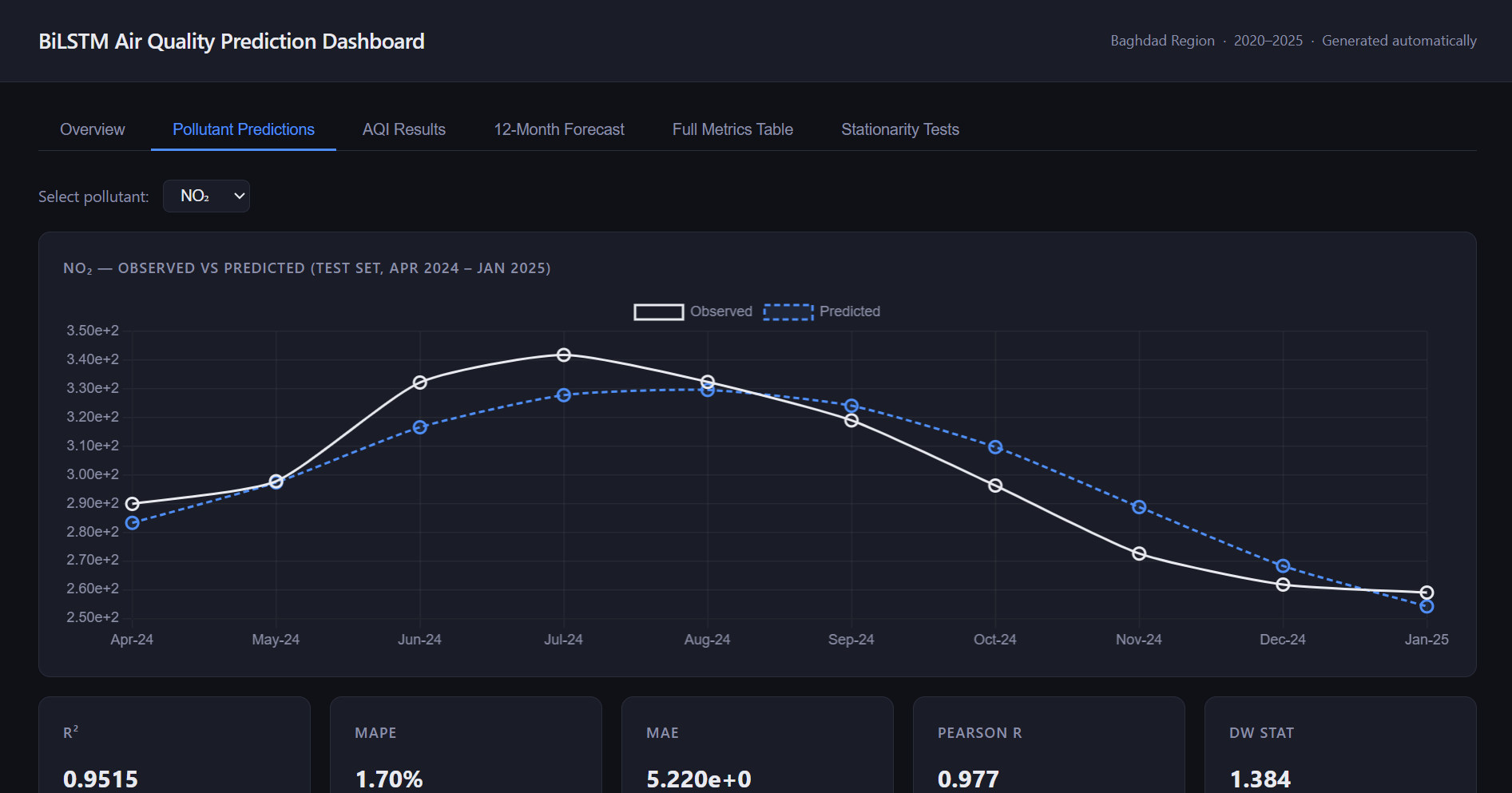
Pollutant Predictions: observed-vs-predicted charts on the held-out
test set, per pollutant.
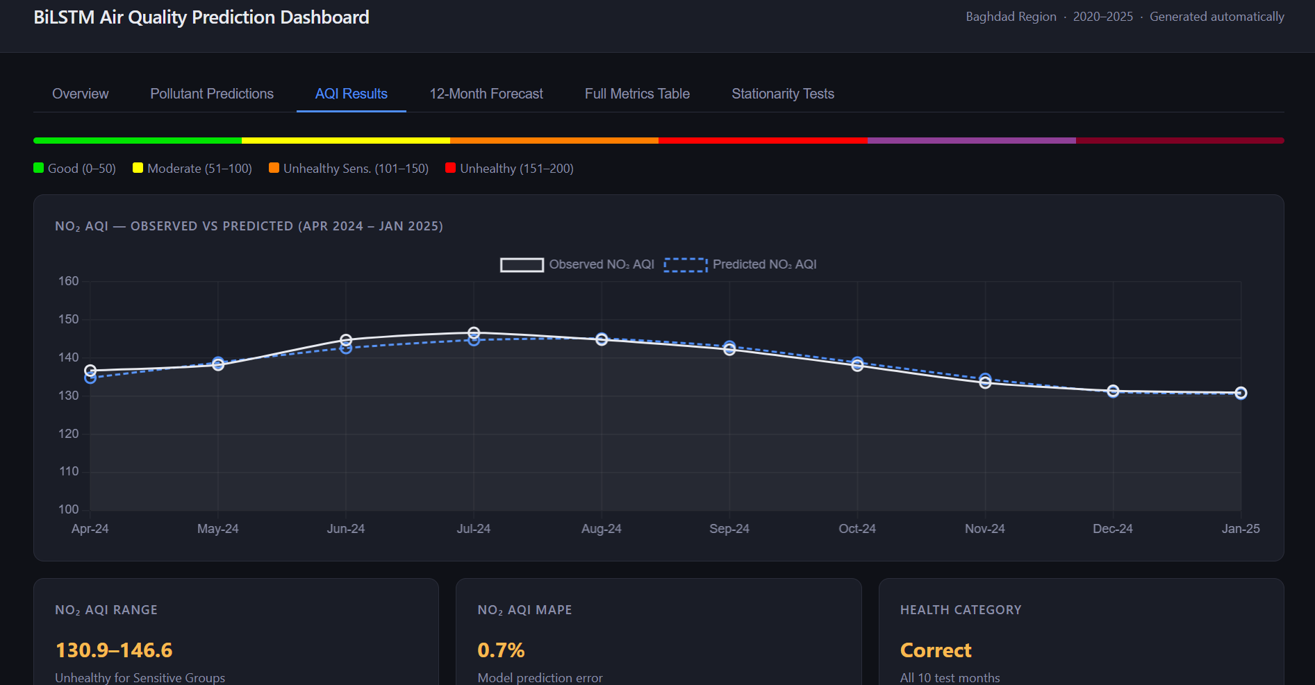
AQI Results: predicted Air Quality Index mapped to US-EPA health
categories (Good / Moderate / Unhealthy for Sensitive Groups / Unhealthy), with
observed-vs-predicted comparison.
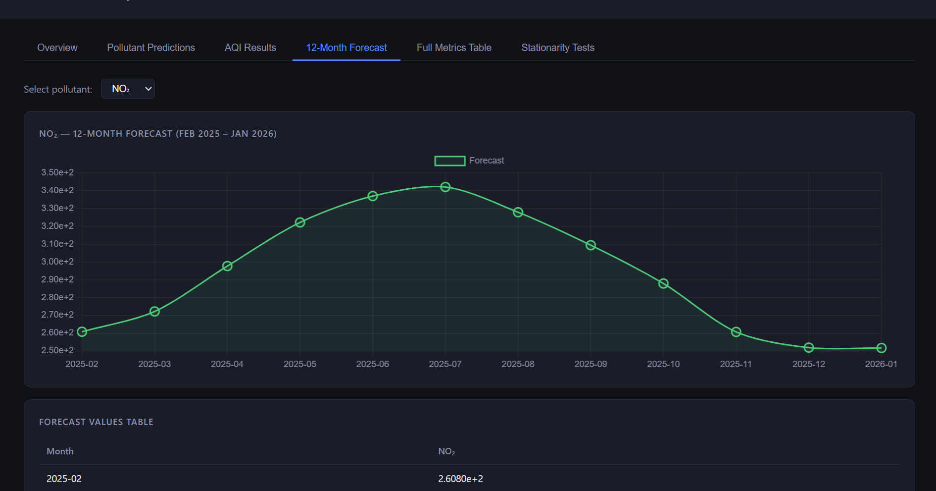
12-Month Forecast: forward-looking pollutant forecasts with
Monte-Carlo-Dropout uncertainty bounds and a month-by-month value table.
Full Metrics Table: the complete evaluation matrix for all five
pollutants side by side.
Stationarity Tests: ADF and KPSS test results per pollutant, checked
before modeling.
NO₂ observed vs. predicted — test set, Apr 2024–Jan 202512-month forecast — NO₂, Feb 2025–Jan 2026AQI classification — observed vs. predicted, with health-category bandsStationarity testing (ADF + KPSS) per pollutant
Architecture
A two-script pipeline, run in sequence: airquality_lstm_publication.py
handles data loading, stationarity testing, seasonal feature engineering, per-pollutant
BiLSTM training/evaluation, and forecasting — writing results out as CSVs and figures.
generate_dashboard.py then compiles those outputs into a single standalone
HTML5 file with Chart.js, so the dashboard has no server dependency at all — it's a static
artifact that happens to be interactive.
Huber loss over MSE: chosen specifically for robustness to
concentration outliers in pollutant readings, rather than defaulting to a squared-error
loss that outliers would dominate.
Seasonal encoding done right: month is encoded as circular harmonic
sine/cosine features rather than a raw integer, so the model doesn't see December and
January as maximally far apart.
Walk-forward cross-validation: used instead of a single random
train/test split, which matters for a genuinely small time series where a lucky or
unlucky split can badly mislead the evaluation.
Uncertainty quantification: 95% confidence bounds on the 12-month
forecast come from Monte Carlo Dropout, so the forecast isn't presented as a single
false-precision line.
Rigorous, honest evaluation: the dashboard reports full metrics for
every pollutant — including the ones where the model underperforms — rather than only
showcasing the best result.
Standard-compliant AQI: AQI is computed per US-EPA methodology for
NO₂ and CO, with an explicit unit-conversion note in the code for the remaining species
(the raw data ships as mol/mol mixing ratios, not the μg/m³ or ppm the standard expects).
Zero-dependency delivery: the dashboard is a single generated HTML
file — no backend, no build step — which is also why it deploys as a static Render site
with no server-side moving parts to keep running.
Results
Model performance varies meaningfully by pollutant. NO₂ forecasting performed strongly:
R² = 0.9515, MAPE = 1.70%, Pearson r = 0.977 on
the test set, with the derived NO₂ AQI achieving 0.7% MAPE and correct
health-category classification across all 10 test months. PM2.5 showed moderate fit
(R² = 0.561), while CO, SO₂, and SO₄ were harder to model reliably in this
run (negative R² on the test set — reported transparently rather than omitted).
0.9515
NO₂ R² (test set)
1.70%
NO₂ MAPE
0.977
NO₂ Pearson r
0.561
PM2.5 R²
Reported honestly: CO, SO₂, and SO₄ forecasts underperformed in this
run (negative R² on the test set) despite fitting the same architecture — a reminder that
not every pollutant responds equally well to the same model, and a clear direction for
further work.